Good design is not just about aesthetics.
It’s about helping people understand information faster and with less mental effort.
That’s where Gestalt principles become incredibly useful.
Originally developed by Gestalt psychology, these principles explain how our brains naturally organize and interpret visual information.
Even if most users have never heard the word “Gestalt,” they experience its effects every single day when using interfaces, reading content, navigating apps, or interacting with products.
And, once you start noticing these patterns, you see them everywhere.
In UX, UI, branding, presentations, service design, architecture, and even social media layouts.
What is Gestalt?
Gestalt is a psychological theory focused on how humans perceive visual elements as organized wholes rather than isolated parts.
That’s because our brains are constantly trying to simplify chaos, we naturally search for:
- Patterns
- Structure
- Continuity
- Harmony
- Meaning
That’s why some interfaces feel intuitive while others feel exhausting.
The clearer the visual structure, the easier it becomes for users to interpret information and make decisions.
Below is a simplified overview of the 8 Gestalt principles that every designer should understand.
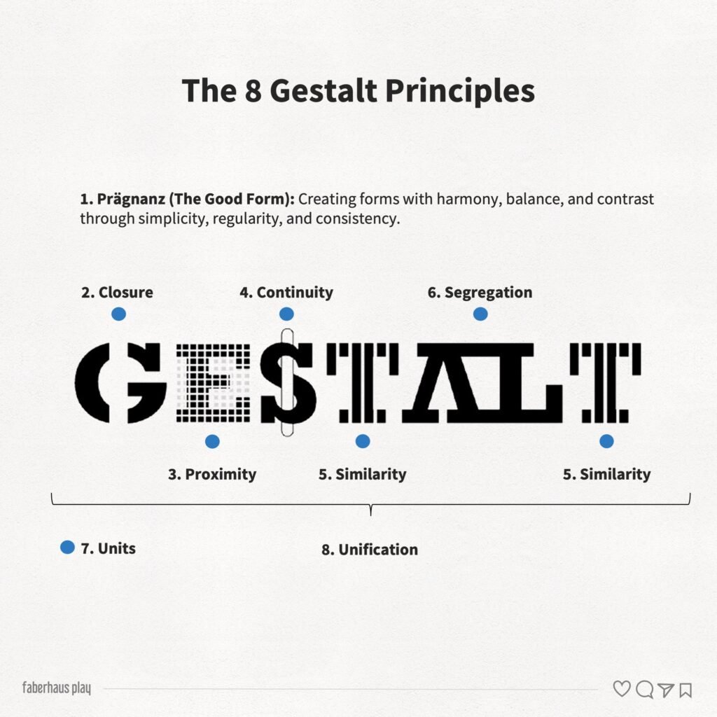
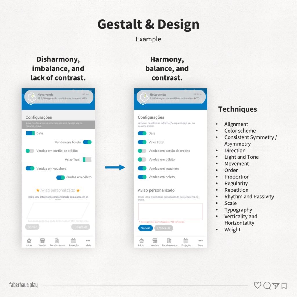
1. Prägnanz (The Good Form)
This is considered the central principle of Gestalt.
People tend to perceive visual compositions in the simplest, most stable, and most organized way possible.
Our brains prefer:
- Balance
- Clarity
- Regularity
- Simplicity
This means:
- Cleaner layouts feel easier to understand
- Organized interfaces reduce cognitive load
- Visual clutter increases confusion
A complicated design does not automatically look sophisticated, sometimes it just looks difficult.
2. Unity
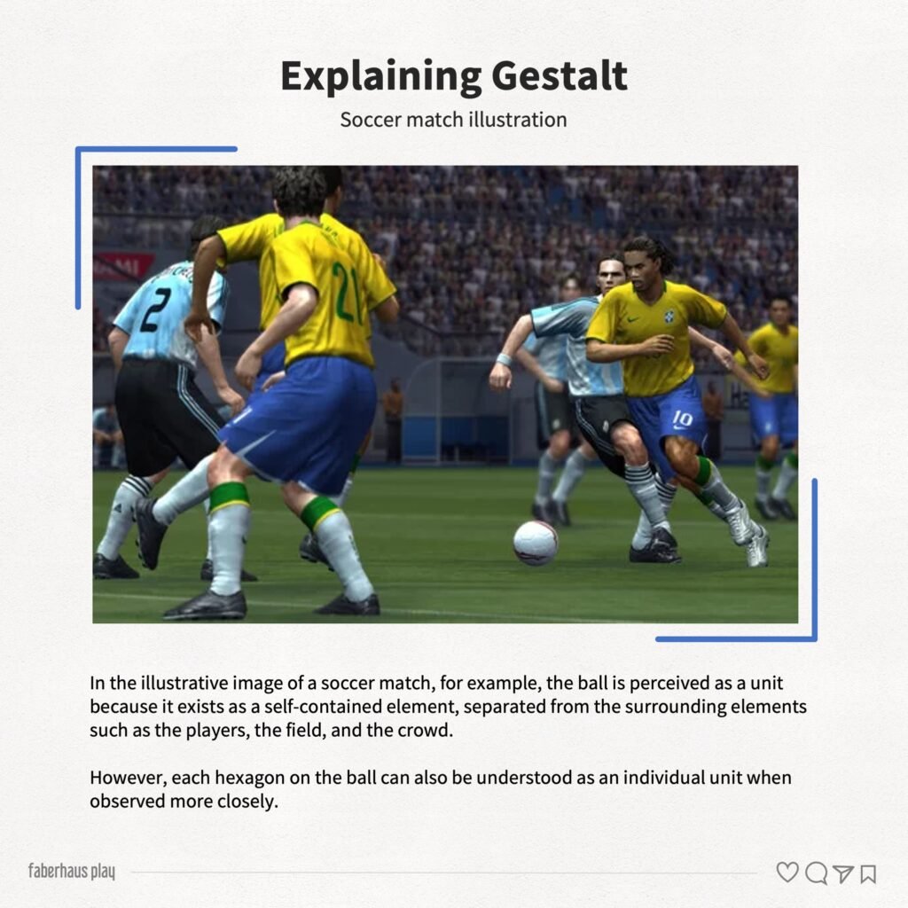
Unity happens when an element is perceived as a single object, even if it contains multiple smaller parts.
For example:
- A button
- A card component
- A logo
- A chart
Even when made of different elements, users interpret them as one cohesive unit.
Strong unity improves recognition and comprehension.
Weak unity creates ambiguity and confusion.
3. Unification
Unification refers to our tendency to group related elements together.
This happens constantly in interfaces.
Users naturally associate elements that share:
- Colors
- Shapes
- Typography
- Spacing
- Alignment
- Visual style
For example:
- Menu items
- Cards from the same category
- Buttons with the same function
This principle helps users quickly identify relationships between elements.
Without it, interfaces feel fragmented.
4. Closure
Our brains dislike incomplete shapes.
When visual information is partially missing, we instinctively try to “fill the gaps” and complete the form.
That’s why logos, icons, and illustrations can work even with missing parts.
If the structure is clear enough, the brain finishes the image automatically.
Designers often use closure to:
- Create minimalist visuals
- Simplify compositions
- Reduce visual noise
- Create more memorable shapes
- Facilitate recognition and visual abstraction
5. Proximity
Elements placed close together are perceived as related.
This is one of the most powerful principles in UI and UX design.
Spacing alone can define:
- Hierarchy
- Grouping
- Relationships
- Structure
And interestingly:
- Users notice spacing problems immediately, even when they cannot explain why something feels “off”
Good spacing improves readability and comprehension almost instantly.
Bad spacing creates confusion faster than most designers realize.
6. Continuity
Our eyes naturally follow smooth and continuous paths.
We prefer flows without abrupt interruptions.
That’s why:
- Aligned layouts feel more comfortable
- Smooth curves feel more natural
- Organized reading flows improve usability
Continuity helps users predict where information goes next.
And prediction reduces mental effort.
This principle is especially important in:
- User flows
- Navigation
- Presentations
- Dashboards
- Storytelling
7. Segregation
Segregation is our ability to distinguish one element from another.
Contrast plays a huge role here.
We separate elements based on:
- Color
- Size
- Shape
- Texture
- Position
- Movement
Without clear segregation:
- Buttons disappear
- Hierarchy collapses
- Interfaces become tiring to use
And this makes a surprising number of usability problems figure out in segregation, not in technology problems.
8. Similarity
Elements that look similar are perceived as belonging together.
This principle helps users quickly understand patterns and behaviors inside interfaces.
For example:
- Same button styles imply same interaction type
- Repeated visual structures create predictability
- Consistent components reduce learning effort
Consistency is not only aesthetic, but also cognitive.
Users feel more confident when patterns remain stable.
Why Gestalt still matters in UX design
Many designers learn tools before learning perception, that’s backwards.
Tools change constantly, human perception changes very slowly.
Understanding Gestalt helps you:
- Create clearer interfaces
- Improve usability
- Reduce cognitive overload
- Organize information better
- Guide attention intentionally
- Make designs feel more intuitive
And perhaps most importantly:
It helps you design for how people perceive the world, not how you think they do.
And that difference matters more than we realize.
References
João Gomes Filho. (2009). Gestalt do objeto: Sistema de leitura visual da forma (9th ed.). São Paulo: Escrituras.